Not much to say here. I’ve used the 2014 version of this chart in previous posts.
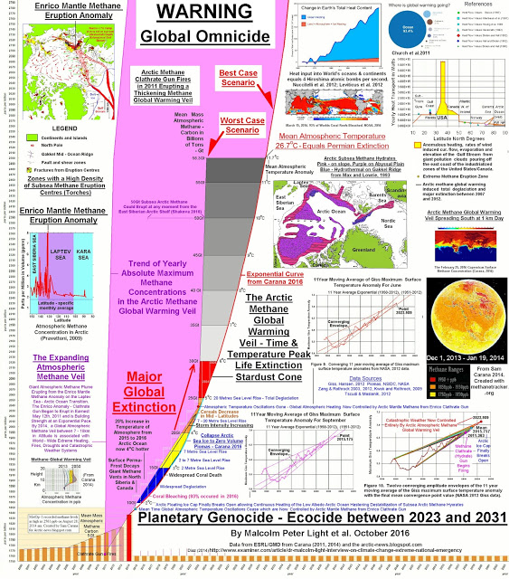
This chart is a bit complicated. The numbers along the bottom are years, with the chart at 2016. The numbers along the left side are estimates of methane in the atmosphere. The (mostly) pink triangle predicts when certain milestones will be released (2 C temperature above baseline, end of polar ice, etc). Other helpful info is tucked into the chart, such as clathrate gun overview, water levels, etc. It’s a helpful graphic layout of where we are right now in terms of climate. And it is not good news. There’s more on the specifics on the AMEG website, which titled this page ‘Global Omnicide’.
As my friend Kevin Hester likes to close with, “Brace for impact”
An updated enviro chart from the Arctic Methane Emergency group.
