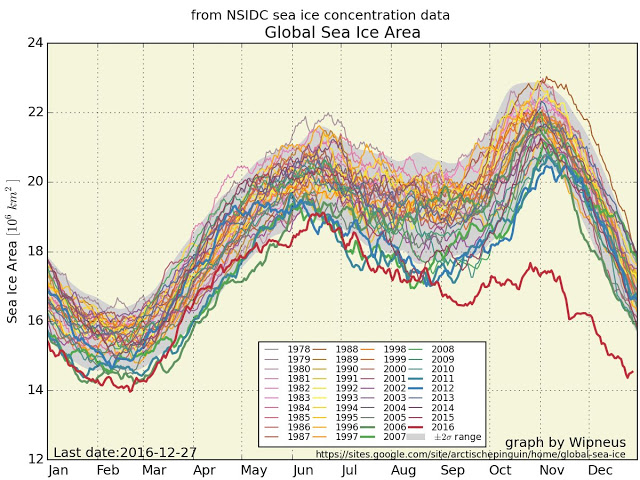
The red line in this chart is where global sea ice area is as of the end of December 2016. The overall chart shows there has been an abrupt change in how gradually these changes occur.
This is a follow up to an article I did when we still thought the US was going to elect someone as president who was venal but sane (as opposed to venal/batsh*t crazy). The article was brought to my attention by some other bloggers including Robert Scribbler and Robin Westenra, along with friends David Petraitis and of course Guy McPherson.
You can find the first charts on my article ‘Pedal to the Metal?’ where I opined that the Powers that Be have decided we’re screwed, so let’s not leave any climate un-destroyed. That’s clearly the agenda of the Trump administration. But here’s the deal. We will know in a matter of weeks if there’s any chance of the Sea Ice coming back. But the above chart is almost apocalyptic in its measurement of what’s happened to ice this year. And warming in the Arctic has been at or near record levels over the past few weeks. The ice is the one thing keeping ocean temperatures low enough to allow for the phytoplankton to continue producing half of the world’s oxygen. If the phytoplankton stops working, we’re in for a very ugly ride to extinction.
again, I offer this warning
Really. like now. Put it on a credit card you’ll never pay.
